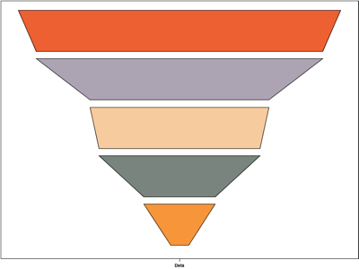
Version 2.4 of the Graph library allows you to use a stacked bar chart with a few extra attributes to display data in a funnel chart.
Funnel charts are controlled by the new bottombarwidth and topbarwidth attributes on the stackedbarseries element. These attributes control the width of the funnel top and bottom, and the graph library will scale the width of the graph between these values, as shown below:
<axesgraph width="800" height="600"
    backgroundcolor="#FFFFFF">
  <stackedbarseries name="Funnel Example"
    bottombarwidth="0.2" topbarwidth="1.0">
    <barseries name="2001" color="#F7953A">
      <data x="Data" y="5" />
    </barseries>
    <barseries name="2002" color="#79847E">
      <data x="Data" y="8" />
    </barseries>
    <barseries name="2003" color="#F6CB9E">
      <data x="Data" y="11" />
    </barseries>
    <barseries name="2004" color="#ACA3B3">
      <data x="Data" y="15" />
    </barseries>
    <barseries name="2005" color="#ED6032">
      <data x="Data" y="25" />
    </barseries>
  </stackedbarseries>
</axesgraph>
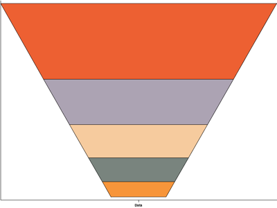
As the image above shows, the width of each series has been scaled according to its relative height to present the data in a simple funnel shape.
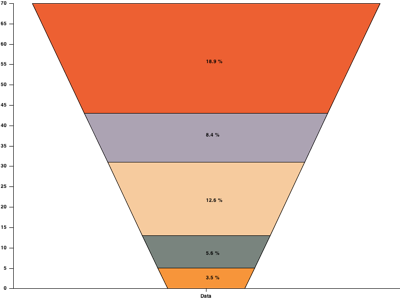
The examples below demonstrates this, as well as some labels on the chart.
<axesgraph width="800" height="600"
    backgroundcolor="#FFFFFF">
  <stackedbarseries name="Funnel Example"
    topbarwidth="0.9" bottombarwidth="0.2">
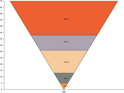
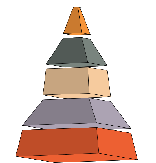
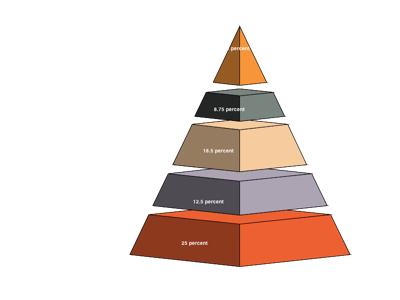
Notice how if you set bottombarwidth to 0 you get a pyramid chart.
<axesgraph width="800" height="600"
    backgroundcolor="#FFFFFF">
  <stackedbarseries name="Funnel Example"
    topbarwidth="0.9" bottombarwidth="0">
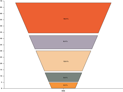
Another new attribute for the stackedbarseries element is bargap, which lets you set how much space to leave bar series:
<axesgraph width="800" height="600"
    backgroundcolor="#FFFFFF">
  <stackedbarseries name="Funnel Example"
    topbarwidth="0.9"
  bottombarwidth="0.2" bargap="1.1" >
If you want full control over the top and bottom width of each series in your chart then you can move the attributes from the stackedbarseries element onto the barseries elements for full control over how your chart is displayed:
<axesgraph width="800" height="600"
    backwallpaint="#FFFFFF">
  <stackedbarseries name="Funnel Example"
      bargap="0.6">
    <barseries name="2001" topbarwidth="0.2"
      bottombarwidth="0.05"
      color="#F7953A">
      <data x="Data" y="5" />
    </barseries>
    <barseries name="2002" topbarwidth="0.45"
      bottombarwidth="0.2"
      color="#79847E">
      <data x="Data" y="5" />
    </barseries>
    <barseries name="2003" topbarwidth="0.5"
      bottombarwidth="0.45"
      color="#F6CB9E">
      <data x="Data" y="5" />
    </barseries>
    <barseries name="2004" topbarwidth="0.8"
      bottombarwidth="0.5"
      color="#ACA3B3">
      <data x="Data" y="5" />
    </barseries>
    <barseries name="2005" topbarwidth="0.9"
      bottombarwidth="0.8"
      color="#ED6032">
      <data x="Data" y="5" />
    </barseries>
  </stackedbarseries>
</axesgraph>
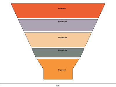
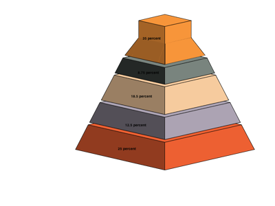
Another new attribute for the barseries element is middlebarwidth, which controls the width of the series bar's midpoint. Changing this allows you to create non-rectangular series, such as a funnel tip for your funnel chart:
<axesgraph width="800" height="600"
    backgroundcolor="#FFFFFF">
  <stackedbarseries name="Funnel Example"
  topbarwidth="0.9" bottombarwidth="0.2"
  bargap="0.9">
    <barseries name="2001" color="#F7953A"
      bordercolor="#000000" middlebarwidth="0.25">
      <data x="Data" y="7" />
      <label x="Data" y="3">35 percent</label>
    </barseries>
    <barseries name="2002" color="#79847E"
      bordercolor="#000000">
      <data x="Data" y="3" />
      <label x="Data" y="2">8.75 percent</label>
    </barseries>
    <barseries name="2003" color="#F6CB9E"
      bordercolor="#000000">
      <data x="Data" y="5" />
      <label x="Data" y="3">18.5 percent</label>
    </barseries>
    <barseries name="2004" color="#ACA3B3"
      bordercolor="#000000">
      <data x="Data" y="4" />
      <label x="Data" y="3">12.5 percent</label>
    </barseries>
    <barseries name="2005" color="#ED6032"
      bordercolor="#000000">
      <data x="Data" y="5" />
      <label x="Data" y="3">25 percent</label>
    </barseries>
  </stackedbarseries>
</axesgraph>
And of course, as funnel charts are the same as stacked bar charts then you can use any of the other attributes available for those charts to rotate the charts and display them in 3D, as shown below.
 |
 |
 |
An important feature of funnel charts is that they were designed around a single stacked bar series chart, so if you try to combine multiple funnel bar series in a single chart then the results will be unpredictable.